Have you ever stared at a word for so long that the spelling begins to look wrong?
In logo creation, we designers are OBSESSED with the lines, curves, and shapes the letters of our language make when placed next to one another. Serifs, sans-serifs, scripts, block fonts, and slabs can change the mood and emotion of a word. It’s easy to find yourself wrapped up in an emotional journey of letters struggling to find just the right way to say something, without needing to say anything at all.
Since man has been able to communicate, letters have been a necessity to languages around the world. Starting with cave paintings humans needed a way to communicate without a voice — pictured turned into symbols, symbols turned into letters, and letters formed words. However, to the everyday person typography, traditionally, was an element of necessity with a simple utility function. That’s not the case anymore. In today’s digital age font options are endless and with access to so many options, typography has gone mainstream! People now have favorite fonts and have become more in tune with the emotional response typefaces can add to a message. For a wonderful look at the impact, typography has on our lives, check out the Netflix episode of Abstract with Jonathan Hoefler.

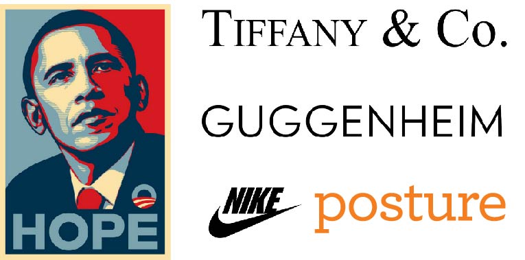
Jonathan Hoefler is a typeface designer and the founder of the Hoefler Type Foundry and typography.com. You may not realize it, but you probably see his work in your everyday life. His fonts are stables on Apple devices and brands like Tiffany & Co., Nike, and the Guggenheim Museum have commissioned the Foundry for custom brand fonts. The 2008 Obama campaign put Tobias Frere-Jones and Jonathan Hoefler’s font Gotham on the map with its bold san-serif letters exclaiming HOPE and CHANGE on posters seen around the nation.
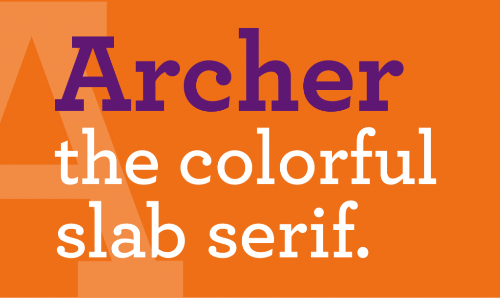
The Hoefler Type Foundry is also the designer of the font, Archer, which we have entrusted to proudly say our name — Posture. Archer is a slab serif font that was originally commissioned for Martha Stewart Living magazine with the goal of being personable, straightforward, and credible. While,at the same time, looking pretty, hard-working, and frank. It makes sense why we chose this font to represent Posture, right?

Typography.com describes Archer as the colorful slab serif: sweet but not saccharine, earnest but not grave, it’s designed to hit just the right notes of forthrightness, credibility, and charm. It’s a font that’s friendly without being silly, and attractive without being flashy, Archer is a typeface that’s well-mannered, easy to work with, and inviting to read…just like our Posture peeps!
As you walk down the street, I encourage you to not just read the words around you, but really look at the letters, what do you think their story is?