Logo Graveyard 2019

Happy Halloween everyone and welcome to Posture’s Logo Graveyard!
Where we keep the logos that are no longer with us...
This year at Posture we’re bringing in a new spooky and haunting tradition. Take a scroll, if you dare, to see the unchosen logos of the past. Read their headstones to see how they made it to the graveyard and don’t forget to check out their lively websites.
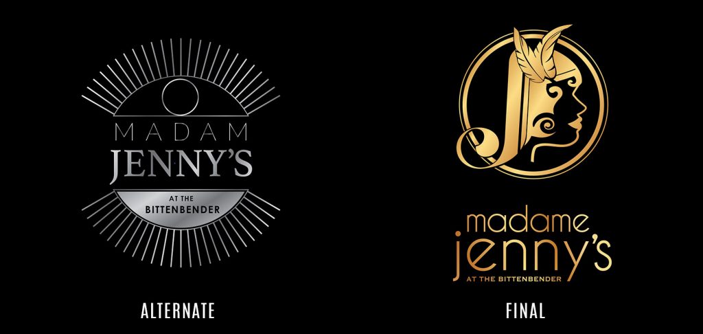
Client: Madame Jennys

Why we like it: Inspired by the dial on the vault door that is currently at the entrance to the speakeasy, this logo is as sexy as it is silver. Also a nod to the feminine mystique of Jenny Duffy with her eye always watching over Scranton and her business – we weren’t going to get away with putting any smooth moves on this logo.
Why it went to the logo graveyard: The Madame was looking for something bolder and more representative of Jenny herself. Don’t you just love seeing her lovely silhouette behind the bar now?
Website (2019): https://madamejennys.com
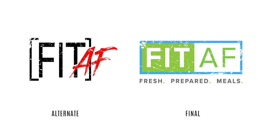
Client: FitAF

Why we like it: This treatment just gives off that “cool kid” vibe. We want to hang out with this logo after school behind the bleachers and listen to Blink 182 while we talk about how much our parents just don’t understand.
Why it went to the logo graveyard: We went just a little too “grunge band meets Japanese steakhouse.” This concept didn’t fully convey the freshness of the amazing healthy food that FitAF provides.
Website (2018): https://www.fitafnutrition.com
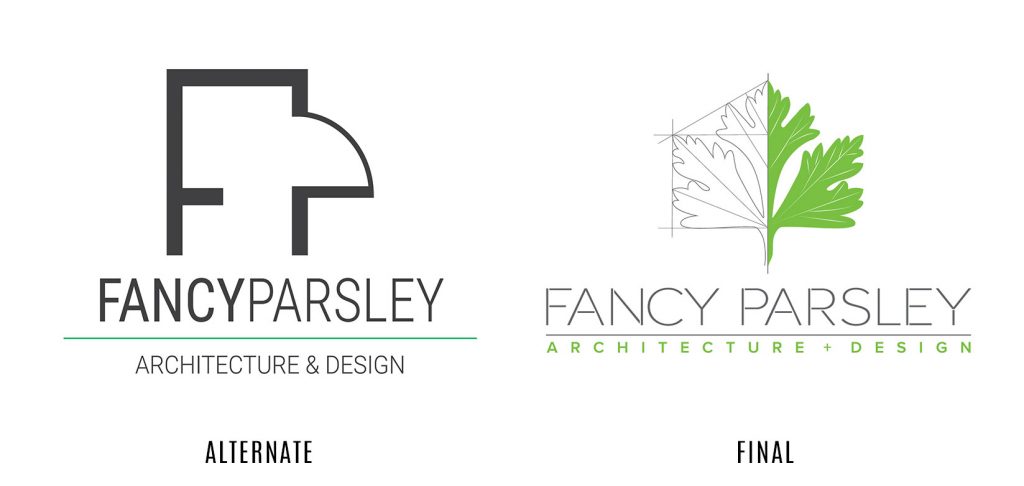
Client: Fancy Parsley

Why we like it: Just like a fine wine, you notice the subtle notes of architecture in this logo as you spend more time drinking it in. The anchor points, the doorways, the possibilities!
Why it went to the logo graveyard: A little fancy, but definitely not much Parsley (and we definitely need to get more greens in our diet). Didn’t quite give off the vibrant and creative personality of the people behind the alluring brand name.
Bonus: We REALLY loved animating the final logo design on this website ?
Website (2019): https://www.fancyparsley.com