Category: Posture Interactive

How the Tables Have Turned
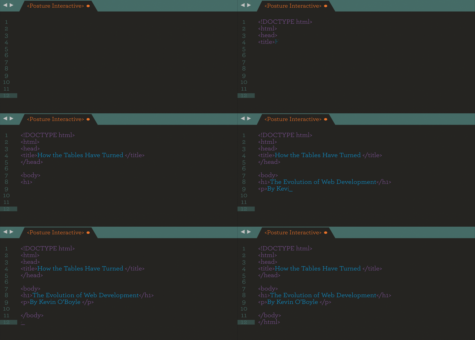
It was the mid-1990’s when I first caught the web development bug. Home computers were just becoming affordable, dial-up was about as good as it got and Geocities was all the rage. (For the uninitiated, Geocities was akin to the great-great-great-great-grandfather of Wix.) The very first website I built was a fan page dedicated to the old TV show “The Wonder Years”, and it had it all! We’re talking about colorful backgrounds, marquee headlines, a view counter and most importantly for any website of the time, a working Guestbook in which viewers could leave feedback.

In those days, the technology stack was fairly simple, relying on mainly just HTML (HyperText Markup Language) with inline styles and built-in tags. Given the lack of options, the table-based layout was king if you needed anything spanning more than one column on the page. Think of an excel spreadsheet; it’s the same concepts where you have rows and columns and can span elements across multiple or single rows to achieve different layouts.

In 1994 everything changed for web developers. 

The first iterations of CSS (Cascading Style Sheets) and PHP were first introduced, with JavaScript following shortly after in 1995. CSS gave developers a way to separate the markup (AKA HTML) from the styles (CSS) so you could have cleaner files by applying styles to multiple elements on the page using classes and IDs. Similarly, PHP allowed the user to create reusable templates and cut down significantly on copying and pasting the same code over and over. It also gave us a convenient way to interact with the web server, allowing us to create forms to pass data from the web browser to the server and back again (think of a basic contact form).

Arguably one of the most important changes to the web happened in 1996, with the advent of Javascript. 

As a front-end language, it allowed developers to take advantage of some functionality previously only afforded by a backend language. Meaning, we could now leverage the power of the browser to capture and change elements on the page without reloading the page. How exciting!

Since then, the web has changed quite significantly. We’ve seen the rise and fall of Flash which offered a great solution for not only animations but also allowed for video on the web. We’ve watched Google go from a little-known web search engine that helped you find your favorite websites, to a global conglomerate and behind every technological solutions is a team of web developers.

Instead of trying to learn ALL of the things, focus on a particular framework that meets your needs, has a good community following (this one’s huge on the path to success)…

Modern web developers now rely on a wide-range of tools beyond just the basics.

We still have the basics: HTML, CSS, Javascript, PHP etc. but now we have sub-choices to make. Deciding WHAT backend and frontend frameworks you want to use is just as important as a designer choosing a color scheme… and what a number of choices we have! There’s a running joke in the web development community that a new Javascript framework is written every day and the names become more and more ridiculous with each iteration. Take for instance handlebars.js which is an extension of the moustache.js templating system. (No. I’m not joking. Look it up. I’ll wait.) 

As the name suggests, it was named mustache because the parentheses look like a Mustache. E.g. {{placeholder}}

With so many choices, how does one decide?

The answer is actually quite simple. Instead of trying to learn ALL of the things, focus on a particular framework that meets your needs, has a good community following (this one’s huge on the path to success) and never stop learning! The reality is that what used to be a single person’s job, now requires a team to be successful. That’s not saying that a lone developer can’t be successful, but behind a single developer is a network of colleagues that help redefine the web landscape through open-source contributions and are available to share expertise on matters that require a unique perspective. As an example, a typical day on the job for me involves the following technologies: HTML, CSS/SASS, Foundation/Bootstrap, Javascript, NPM, PHP, NodeJS, ReactJS, Webpack, SASS, MySQL, WordPress, Adobe XD/Sketch, Photoshop, Illustrator, I could go on but you get the picture!

Whether you’re a Front-end, Back-end, or Full-stack developer, there are so many jobs to be done in order to ensure a successful website. It’s not only about possessing the knowledge and experience of HOW to build a website, BUT also having a good support system from designers, marketers, project managers, and colleagues.

Overall, the community of developers have accomplished so much in just 15 short years, and personally I’m excited to see how far we can push the limits of technology together.

Video Q&A: Heir to The Sleigh Edition

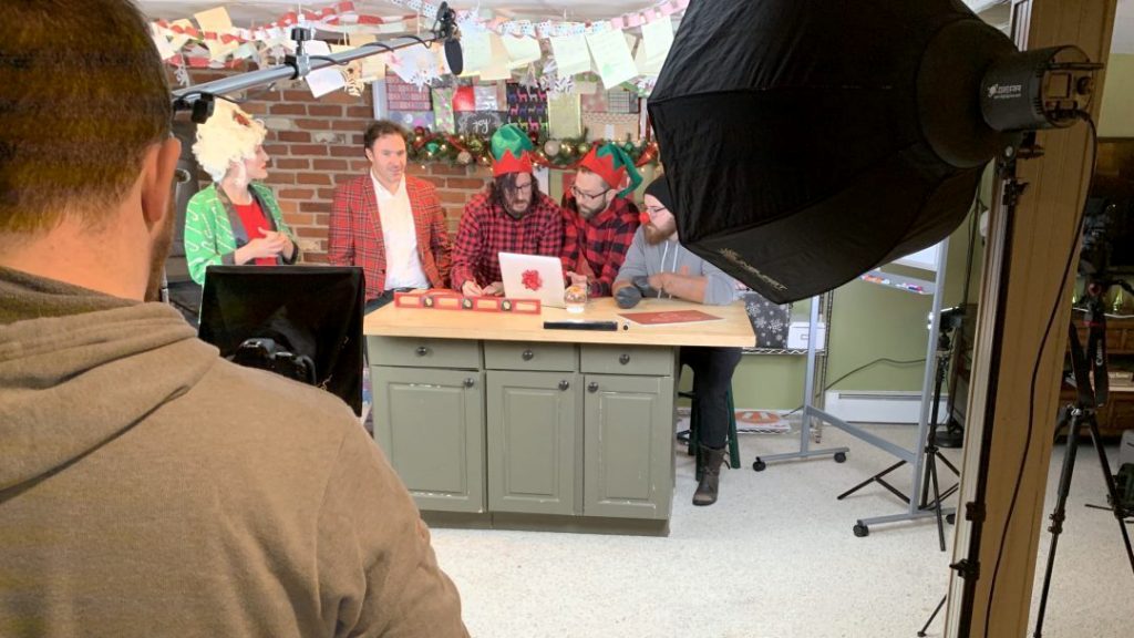
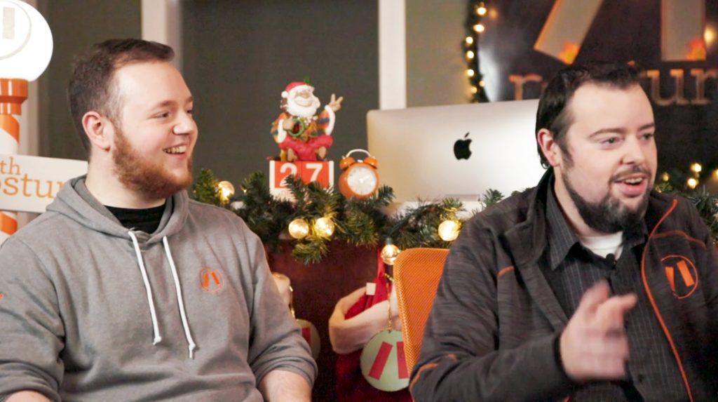
Hello and welcome to Posture’s Video Q&A: Heir to The Sleigh Edition! Today we’re chatting with Sal and Charles about our interactive holiday video, Heir to the Sleigh. Join us for an inside look at the creative process and technical organization that is required for a successful interactive video project.

What was your initial reaction to the idea of an interactive video?

Sal: I knew this was a cool idea from the start! It’s not like any traditional narratives we had done in the past. When you start to make it interactive (similar to the movie Bandersnatch) and add branching paths into the mix, the project starts to get more exciting.

How did you organize such a content-heavy project?

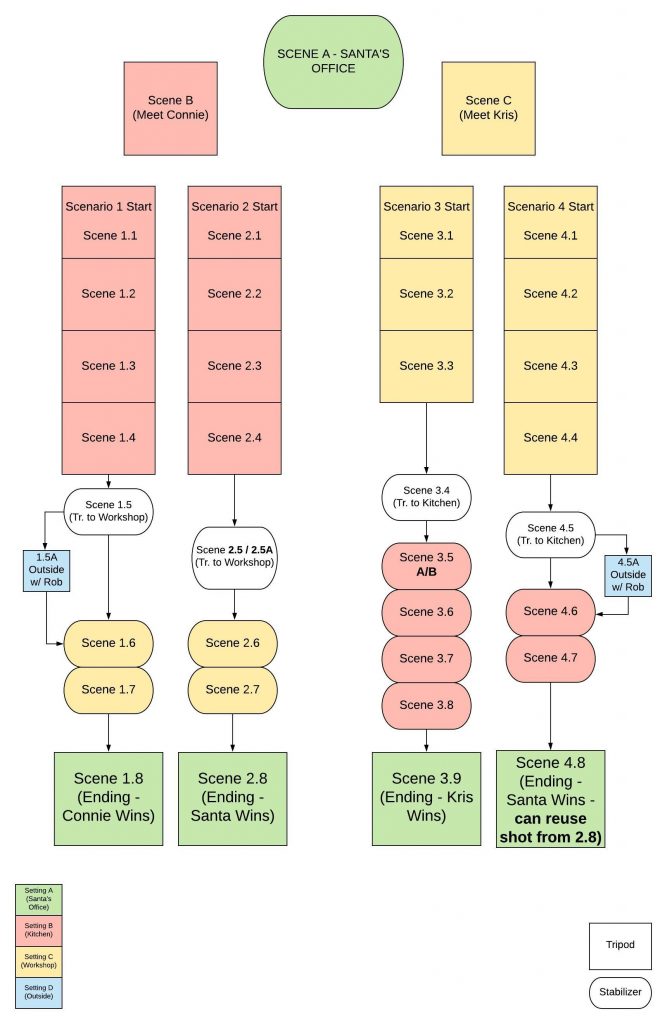
Sal: Once the script came together we immediately started taking all that information and putting it into a visual flowchart (as shown). The chart was very handy on production day!

Charles: Along with the chart we also set up a team project in Adobe Premiere. I worked on the color correction and initial setup while Sal did the cutting. We attacked this project scene by scene, giving each one a number and its own sequence.

What were some of the challenges you faced and how did you overcome them?

Charles: A challenge we faced was developing the right solution for the user experience without sacrificing our vision for the video. We found a few services that did what we were trying to accomplish, but they were for much larger projects. Luckily, our awesome development team was able to save the day with a semi-custom solution.

Sal: Another challenge was our limited time window to shoot all the video content for the project in just one day. So, we decided to keep the execution of the shoot as simple as possible!

Tell us about the editing process and how user decisions influenced the story.

Charles: It was very segmented and organized. Every path had to be siloed to keep our organization and each scene was given its own sequence. An important thing we had to keep in mind with any large video project is quality control. For example, if we do a color correction to one iteration of a clip we have to be sure we’re keeping that color consistent throughout any scenes whenever that shot is used.

Sal: I was surprised to see  how much complexity is added to a video project when you start introducing multiple paths. It definitely took a lot of effort and devotion to maintaining an overall picture of the final product. Oh and LOTS of flowcharts!

Was there anything you would have done differently?

Charles: I try to not look at a project like this as ever completely ‘done’, there’s always improvements that can be made, and keeping it open in my mind can set you up for success.

Sal: The obvious answer is “more time for pre-production”. In a perfect world, every project would have exactly the amount of time needed to plan everything out but that isn’t always the case.

Charles: I agree, but it was still exciting for us to push the limit on something like this!

What would you tell someone interested in video production?

Start yesterday! Your first video won’t be perfect; mine definitely wasn’t. But use whatever tools you’ve got at your disposal, even if it’s just your phone, and get creative! Start assembling a crew of collaborators, friends, supporters, and people who bring out the best in you, mentally and creatively. A lot of cool stuff can come from a group of inspired creators!

Sal Bulzoni

To anyone who has an interest in video production learn from everyone, everywhere! There are so many differing opinions on everything, so listen to people’s production stories, they can teach you a lot.

Charles Ferran

Logo Graveyard 2019

Happy Halloween everyone and welcome to Posture’s Logo Graveyard!
Where we keep the logos that are no longer with us...

This year at Posture we’re bringing in a new spooky and haunting tradition. Take a scroll, if you dare, to see the unchosen logos of the past. Read their headstones to see how they made it to the graveyard and don’t forget to check out their lively websites.

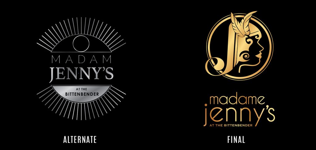
Client: Madame Jennys

Why we like it: Inspired by the dial on the vault door that is currently at the entrance to the speakeasy, this logo is as sexy as it is silver. Also a nod to the feminine mystique of Jenny Duffy with her eye always watching over Scranton and her business – we weren’t going to get away with putting any smooth moves on this logo. 

Why it went to the logo graveyard: The Madame was looking for something bolder and more representative of Jenny herself. Don’t you just love seeing her lovely silhouette behind the bar now?

Website (2019):  https://madamejennys.com

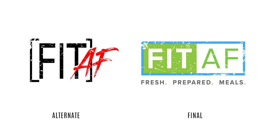
Client: FitAF

Why we like it: This treatment just gives off that “cool kid” vibe. We want to hang out with this logo after school behind the bleachers and listen to Blink 182 while we talk about how much our parents just don’t understand. 

Why it went to the logo graveyard: We went just a little too “grunge band meets Japanese steakhouse.” This concept didn’t fully convey the freshness of the amazing healthy food that FitAF provides. 

Website (2018):  https://www.fitafnutrition.com

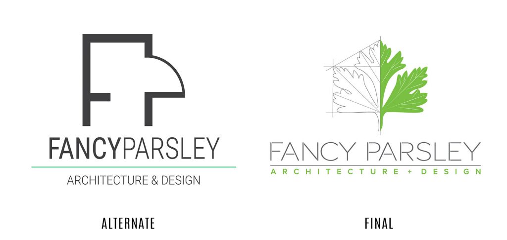
Client: Fancy Parsley

Why we like it: Just like a fine wine, you notice the subtle notes of architecture in this logo as you spend more time drinking it in. The anchor points, the doorways, the possibilities!

Why it went to the logo graveyard: A little fancy, but definitely not much Parsley (and we definitely need to get more greens in our diet). Didn’t quite give off the vibrant and creative personality of the people behind the alluring brand name.

Bonus: We REALLY loved animating the final logo design on this website ?

Website (2019): https://www.fancyparsley.com


You just got Sandstormed

Did you ever have one of those days where the clock magically turns from 10:15 am to 5:15 pm and you have no idea how that happened?  Somewhere between meetings, emails, unexpected visitors and scope creep, you completely lost track of your day and now your head is spinning in disappointment and confusion. You’ve just been sandstormed.

Named after the popular trance techno song of the same name, “Sandstorm” is our Posture term referring to our day being thrown into fast-forward.

I’m sure you’re familiar with the song, but just in case, you can check out the original 1999 track by Finnish DJ and record producer Darude (listen here).

The seven-minute song has an iconic repetitive beat that embodies sheer speed and momentum. When Spotify played this song one too many times in a single day, our entire office found ourselves transported throughout the day with no reason behind the rapid passing of time or scattered nature of our brains. That’s when we coined the term: we had been sandstormed.

FUN FACT:
The song’s name came from the text on the startup screen of the synthesizer used in the song.

So how can you avoid the storm?

Well, first of all, don’t listen to Darude in the office. But the real problem behind an office sandstorm is time management, something we all struggle with.  Here are some ways we try to avoid the storm:

Stop multitasking

Whether we want to admit it or not, our brains are not natural multi-taskers and shifting between tasks and yielding distractions does, in fact, slow us down.

Avoid multi-tasking

Forbes reports “Changing tasks more than 10 times a day drops your IQ an average of 10 points.”

Make a list and check it twice. In our office we use a phenomenal project management system called Asana. With fun checkboxes, project lists subtasks and all notes and conversations housed in one place, it keeps us on task and all tasks in one place.

Stay conscious of the time.  I went through a phase where my mac was set to obnoxiously announce the time every hour on the hour. While it was a creepy robotic voice that was startling to the entire office, it was immensely helpful in giving me a reality check on how long I had spent on a particular task…or how much time I spent avoiding a particular task.

You don’t need to watch the clock to be aware of the time

Track your time

Our agency runs on time as our currency, so it makes sense that we track all of hours as an essential part of our billing system. But it’s easy to rack up three-hours of uncategorized or unbillable time. Treat your own business like you would a client. Maybe no one is pulling those hours for a bill, but at the end of the week you’ll be able to review the data… you’d be surprised how much time you spend answering emails!

Time management

How does the Posture team manage time?

Gabriella Santos

“I like to make small lists and accomplish each task one-by-one.”

Gabby


Kathryn Bondi

“I schedule blocks of time for my daily tasks so that way I’m not bouncing around aimlessly between to-do’s.”

Kat


“Everything kinda feels important to me, so I try to break it down into three categories: critical non-negotiable (eat, sleep, etc.), critical (the meat of the day), and important (everything else).”

Mat


“When it’s time to focus, I throw on headphones and avoid eye contact.”

Jamie


Posture Interactive – Portfolio Reel 2019

We’re pleased as pie to present to you our 2019 Portfolio Reel –  Thanks and much love ?? to all of our clients, friends and family for the continued support you show us. Turn the volume up and enjoy! ?


Intern Spotlight: Carla Henry

Posture is extra #blessed this summer to have not one, but TWO crazy talented interns! We’d like to introduce you to our super-talented design intern coming to us from her school in State College, Carla Henry:

Who are ya?

My name is Carla-Ann Henry, but I’ve always gone by Carla (hyphens are complicated).

Where do you hail from?

I’m from a few different areas. I’m originally from Northeast Pennsylvania but then moved to Northern Kentucky for 7 years. I then moved to Central Pennsylvania for school, and now I’m in Scranton!


What inspired you to study design?

I was always slightly interested in design work and art in general, but what really inspired me is my older sister, Kara. She always knew she wanted to study design and has been professionally working at a design firm in Kentucky for two years now. Her journey really pushed me to pursue design as a career.

Who inspires you lately?

Personally, I always think my sister inspires me. I constantly see her work and talk to her about different projects and it really inspires me to continue and grow in what I’m doing.

What’s the best thing about going to school in State College?

The best thing was probably how close everything is to each other. There isn’t much outside of State College, but when you’re in it there’s a good number of shops and different places to eat. Downtown State College is always super busy, but when the Penn State students leave it’s always nice to take a trip Downtown.

Why did you choose to come to Posture Interactive in Scranton, PA for your internship?

As I mentioned before, my sister has always been my inspiration and who I look up to. During my internship search, I looked back at her firm and saw how happy she was in her setting. She was surrounded by great people who were all like a family to each other. When I visited her firm I could instantly feel positive energy and the happiness that everyone there shared. They also did GREAT work! So I decided to look for a place like that for myself, and I really think I found that in Posture Interactive.

What is the most interesting project/client you’ve worked on at Posture Interactive?

The most interesting is definitely a visual food menu in multiple languages for a local hospital. I didn’t even know that they were a thing, but I’ve become very familiar with the one I’ve been working on.

What would you tell fellow students who haven’t had an internship yet?

I would tell them to look for an internship with the intention of really getting to know what kind of environment you want to be in when you’re working. There are so many people out there with your exact level of skill, but what will really set you apart from the others is how well you fit into that environment, and that’s what you want to look for.

What is your ideal project?

My ideal project is one where there’s a healthy amount of communication and flexibility between you and your client. Incorporating illustrations is also a plus!

What’s your favorite computer program?

As far as Adobe Creative Cloud goes, I always gravitate towards Illustrator. Making vector illustrations has always been so much fun for me to work with. Other than that, I would definitely go with Sims 4 (if that counts as a computer program).

Do you have a favorite location in Scranton?

I haven’t been able to explore too much of Scranton yet, but if I had to pick a favorite so far it would be the parking lot of this one building downtown that I couldn’t even tell you the name of.

This year for St. Patty’s day (when I wasn’t living here yet) I was invited to a work get-together in a parking lot downtown and I was immediately immersed in the spirit of Scranton. It was the closest thing resembling city-wide parties in Cincinnati, and it felt like home.


True or false: Dogs really run the show around here at Posture.

TRUE! The whole office makes sure to greet every dog that comes through, and every dog gets all of the pets they want!


Intern Spotlight: Gabby Santos

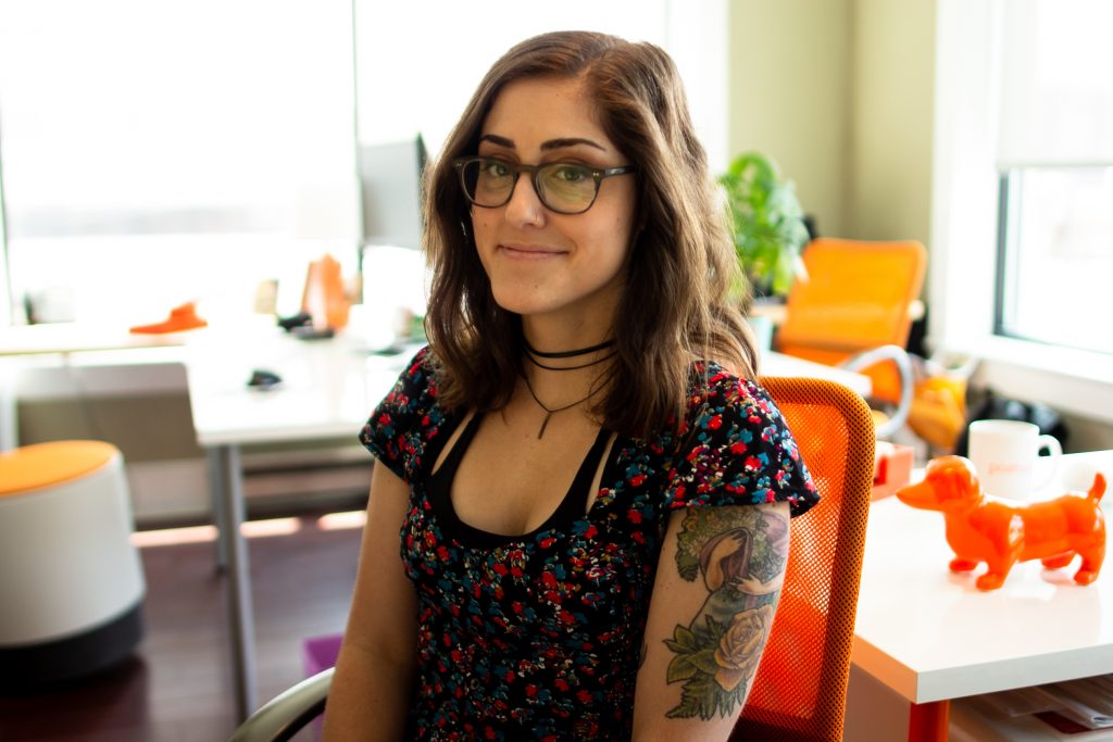
At Posture, we’re delighted to have so many talented interns come through our doors. This week, we’d like to introduce you to our intern and communications student at Marywood University : Gabby Santos.

What’s your name?

Gabby Santos (AKA “Good At Being Bad Yo”)
Also, you can follow my weenie dog on Instagram: @texas_weiner

Where are you from?

I am from Del Rio, Texas

What inspired you to study communications? 

I took a dual credit class in high school called Principles of Marketing and Finance and my teacher at the time, Ms. G, influenced and inspired me to pursue a degree in marketing.

Who inspires you lately?

A lot of people have inspired me lately. My family always inspires me to work hard and to dream big. My former volleyball coach, Carissa, inspires me to be confident in myself and to thrive in every situation. Lastly, my best friends from home and college inspire me every day to try new things and go on spontaneous adventures.

What’s the best thing about going to school in Scranton? 

The best thing about going to school in Scranton is experiencing the diverse culture, meeting amazing people, and making lifelong friends.

What is the most interesting project/client you’ve worked on at Posture Interactive?

An interesting project I’m working on is the Scranton Parking Campaign because I get to see a marketing campaign from start to finish. The most interesting client I’ve worked on is Avanti because I got to go to an event and talk about the product that we’ve created marketing around.

What is the biggest piece of advice or working skill you’ll take with you from your intern experience here?

The biggest piece of advice that I would take away from this internship is to be myself and express my opinion. When you first start an internship sometimes it can be slightly intimidating just because you want to make a good impression but the purpose of an internship is for you to be yourself and to ask questions and test your knowledge.

What would you tell fellow students who haven’t had an internship yet?

For students who haven’t done an internship yet, I highly recommend that they try and land an internship within their field of study. I have done a few internships within my field and it has helped me figure out what I want to do.

What is your ideal project?

My ideal project is one I am actually working on currently which is the parking campaign and developing it from scratch. I get to be a part of crucial market research, data collection, and data analysis. 

What’s your favorite digital tool or program?

I don’t have a favorite program specifically but if I had to pick it would be Chrome.

Which Coney Island is better?

I would have to say the Coney Island underneath the bridge is my favorite one.

Ketchup, Mustard, or other?

Ketchup for sure. 

True of false: Doug knows more bands than anyone else in the office.

I feel like this is true. He gives me a band connoisseur vibe.


Hot Diggity Dog!


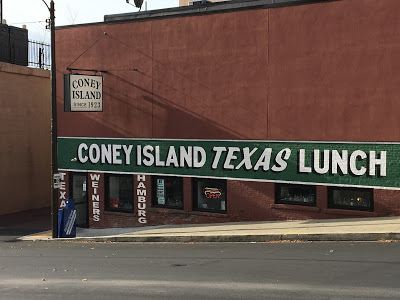
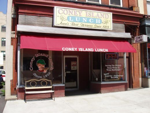
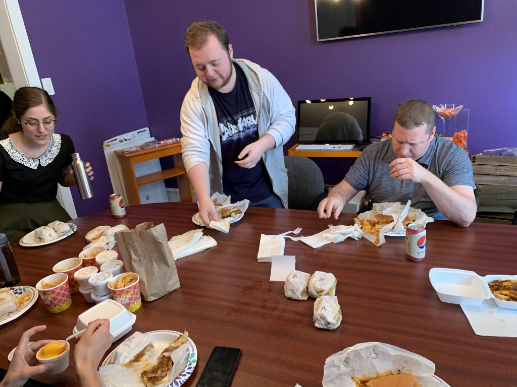
This past week tensions were high. A common Scranton debate had become the center topic of discussion and we needed to end it once and for all. Many locals know about the two Coney Islands located near the 500 block on Lackawanna. They’re both very similar. Small, quaint hot dog shops that serve greasy, heartburn-inducing disco fries and hot dogs piled on with chili, cheese, and onions. In fact, rumor has it that the owners are actually brothers, and after a dispute, they opened two separate shops: one with the original recipe, and one the original location. We knew that to settle our office’s debate we had to do a taste test.


Coney Island of Scranton (Hot Dog A)

Coney Island Lunch (Hot Dog B)


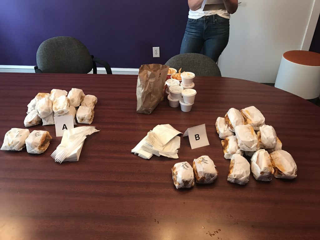
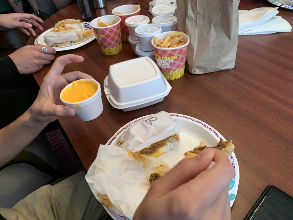
We ordered hot dogs and fries from both locations and sorted them into hot dog A and B, without revealing where they were from. Then we indulged. As the hot dogs dwindled in number and groans of pleasure and regret filled the office we cast our votes.


The sorted dogs

We scored each hot dog out of five, then added them up to get our overall average results. Here were our results:
Hot Dog A: 3/5
Hot Dog B: 4/5

Overall, we thought Coney Island Lunch on Lackawanna had better hot dogs. However, we did agree afterward that the disco fries were better at The Coney Island of Scranton.

After a tried and true measure of testing, the office is still just as divided, but at least this time we have proof which is better.


The winner of the best chili dog of Scranton!

A Branding Jumpstart for Luzerne County Head Start

We’d like to introduce you to our friends at Luzerne County Head Start.

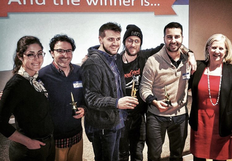
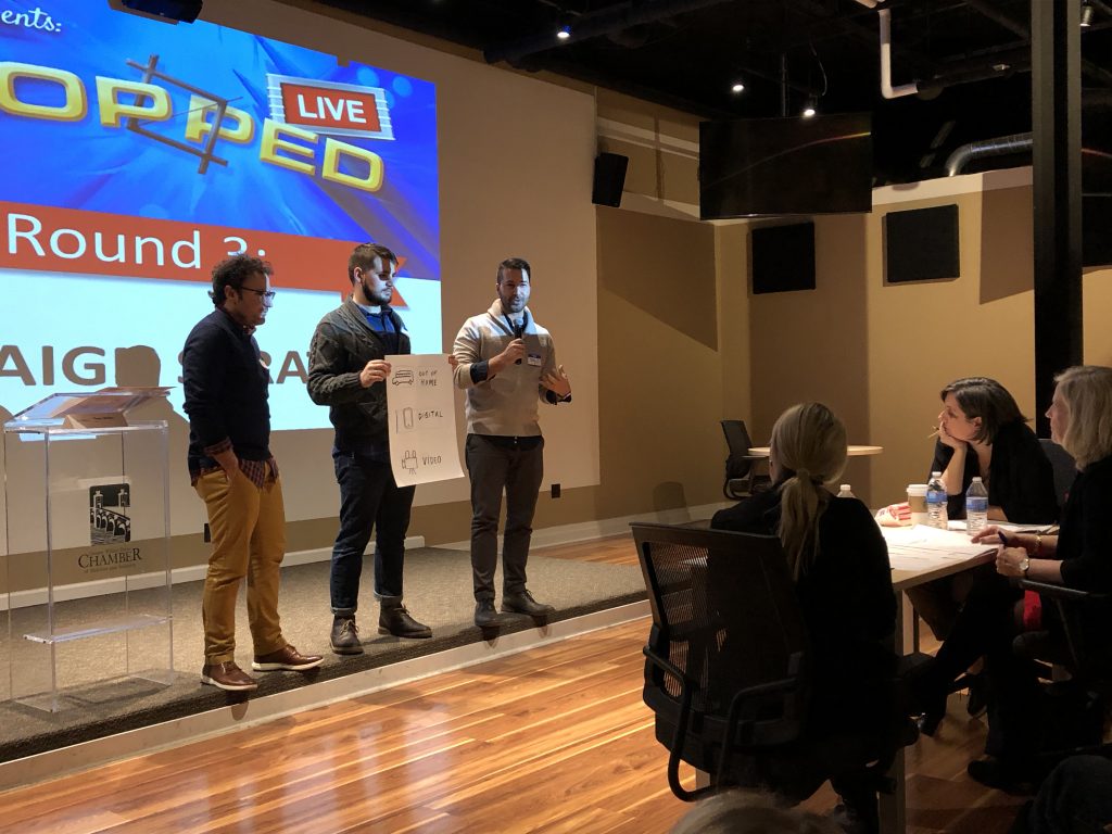
Nearly 6 months ago we participated in “Cropped“, a creative competition hosted by the American Advertising Federation of NEPA that helps non-profits receive new or updated branding through 3 fast-paced rounds of competition between local marketing companies. Luzerne County Head Start (LCHS) was chosen as last year’s featured non-profit, so they presented their list of marketing needs at the competition in November. Each of the teams had to create a logo, tagline, and campaign strategy in 20-minute segments while using only markers, crayons and craft paper. After each segment, a team was eliminated (“cropped” out) by a panel of judges until there was only one team left. The winning team then worked with the non-profit to complete the suite of marketing materials they proposed during the competition at no cost to the nonprofit.

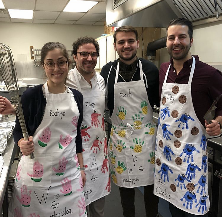
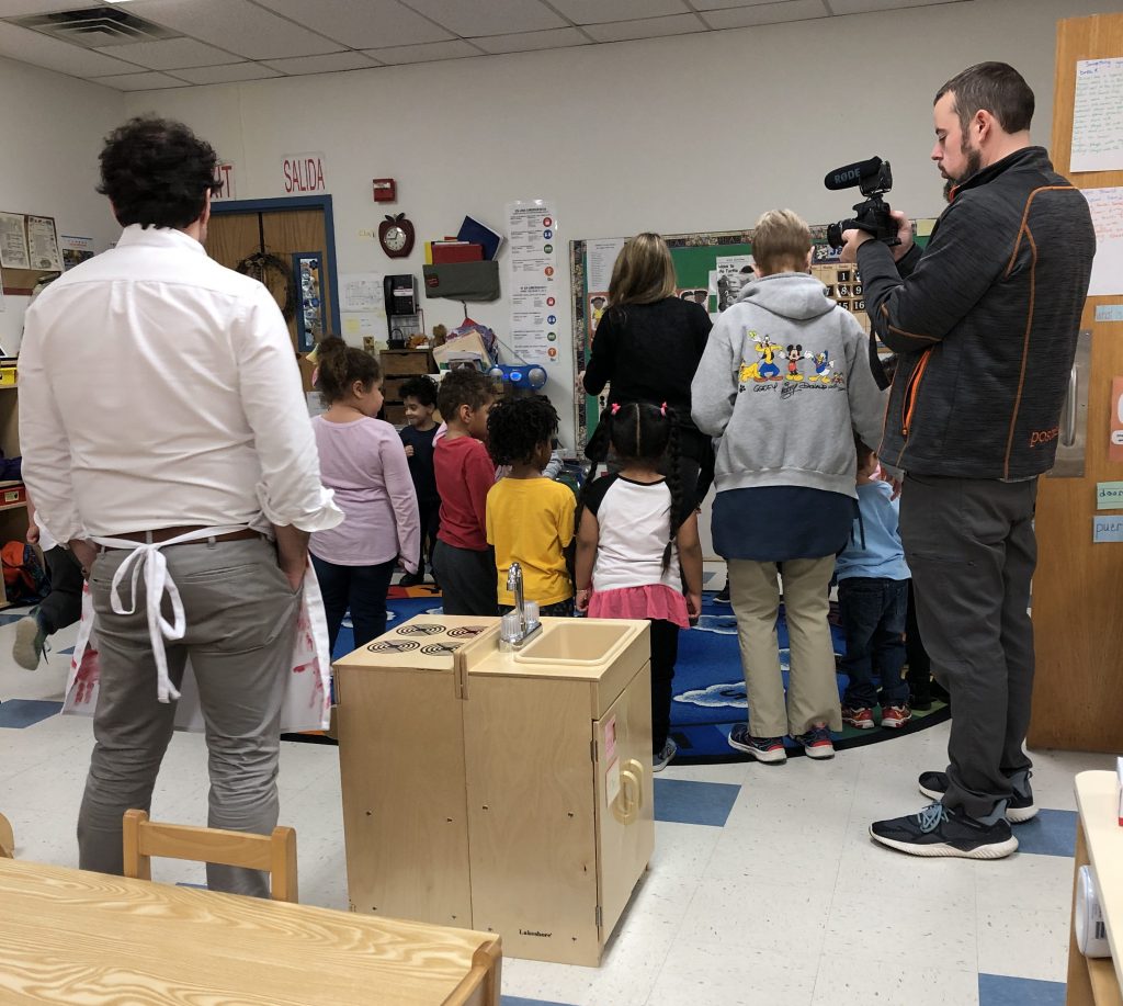
After some creative crayon drawings, brain-busting brainstorming, and witty word-play, Posture ascended through the rounds and won the competition. The best part? We got to work closely with the wonderful Head Start team and we were even invited to visit their location in Wilkes-Barre to help make pancakes and eat breakfast with the kids.

Head Start promotes the school readiness of young children from low-income families through agencies in their local community. Head Start and Early Head Start programs support the comprehensive development of children from birth to age 5, in centers, child care partner locations, and in their own homes. This includes a wealth of information of resources for new or soon-to-be new parents.

Even with such a fantastic wide-spread mission, LCHS still needed a hand with their marketing to help garner the support of more community resources and funding. They actually have a wait list for children to get in because there are many families who can benefit greatly from these programs, but Head Start only has so many open seats for children in the area with their current resources. So in addition to developing a new refreshed logo and a tagline that better expresses the mission of Head Start, we also created a campaign strategy to get the word out.

After seeing how excited Lynn and the team were to use their new marketing materials, we knew we were hooked on Head Start and we couldn’t stop there. The team approached us about giving their website a much-needed overhaul, and we gladly whipped up a proposal for what we know will be a great new chapter for Luzerne County Head Start. Stay tuned for great things to come for our friends at LCHS!


The Greatest ADDY’s

The American Advertising Awards (or AAA…or Addy’s) is our favorite annual event for local advertising and marketing companies to come together and share in their year of accomplishments. Hosted by our friends at the American Advertising Federation of NEPA, the awards are the culmination of a judged advertising competition that starts on a local and advances to a regional then then national level. For us, it also showcases the amazing growing pool of talent we have right here in NEPA and provides a wealth of inspiration.

To say we had a blast would be an understatement – this year’s Addy’s was the GREATEST Addy’s! The whole event was inspired by the recent musical: “The Greatest Showman,” having the matching theme and triumphant theatrics we all appreciate here at Posture.

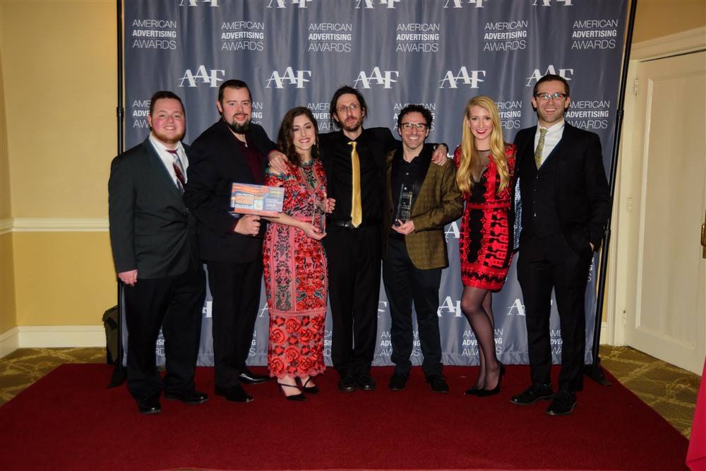
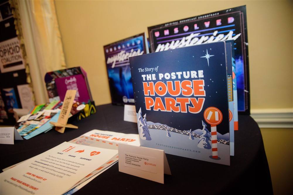
We were recognized for the House Party campaign and Seed to Farmacy campaign we did this past year. We love working with clients who give us the opportunity to create innovative interactive experiences. For more info about our project visit our project showcase here.

Congratulations to all winners and contestants, it was a really fun and inspiring night and we can’t wait to see what you come up with next!


Hello!

  • FYI... If this is regarding a new project - please go back and simply use the "Start a Project" button so we can better help you out!